Scope
Modernizing and energizing a leader in outsourcing
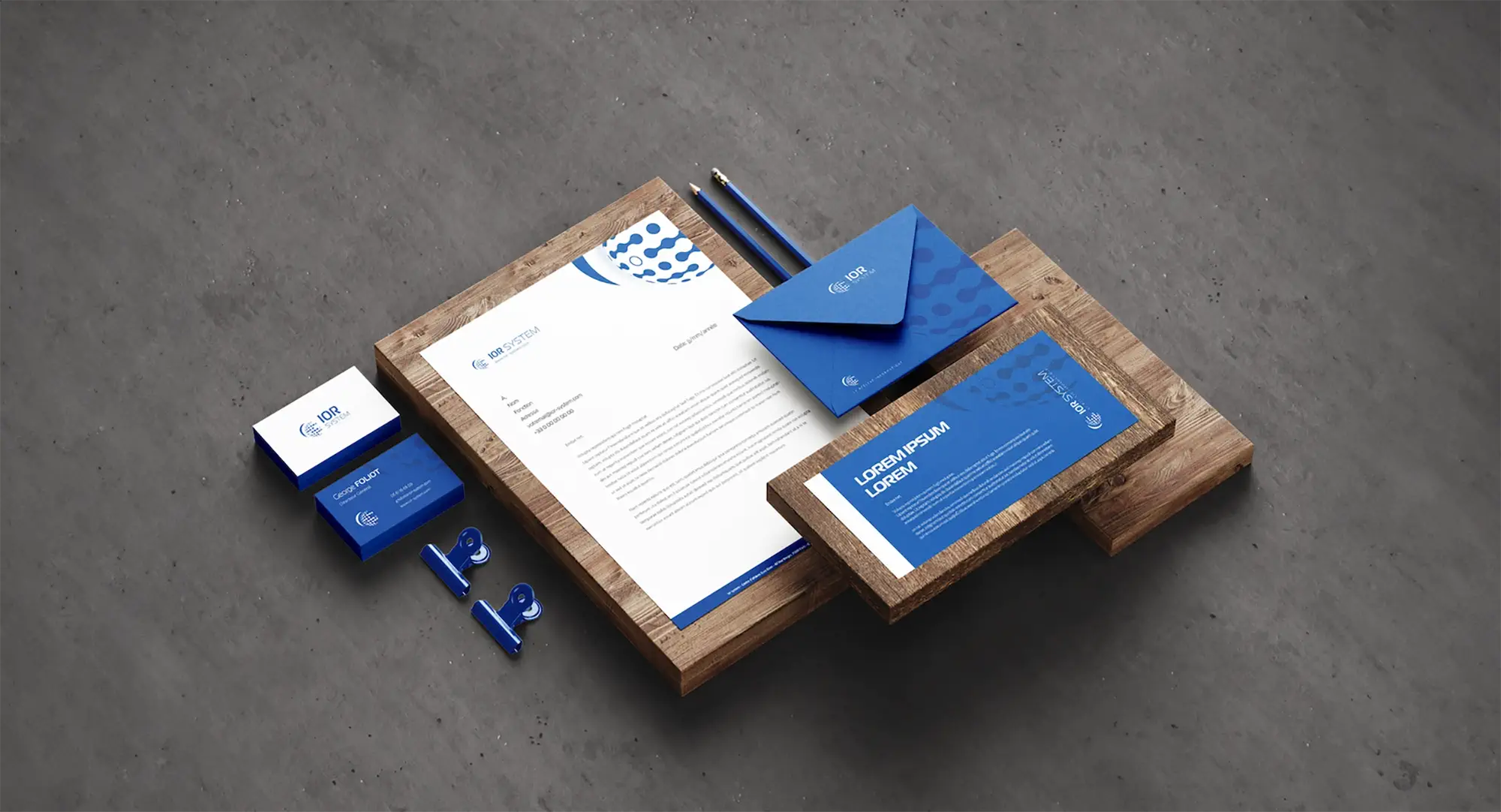
Faced with the need to modernize its image and strengthen its digital presence, IOR System entrusted me with rebranding the group and overhauling its communications strategy. Our objective was to create a visual identity that reflected both IOR System’s technical expertise and customer-centric approach.
Production
Manage, secure, optimize
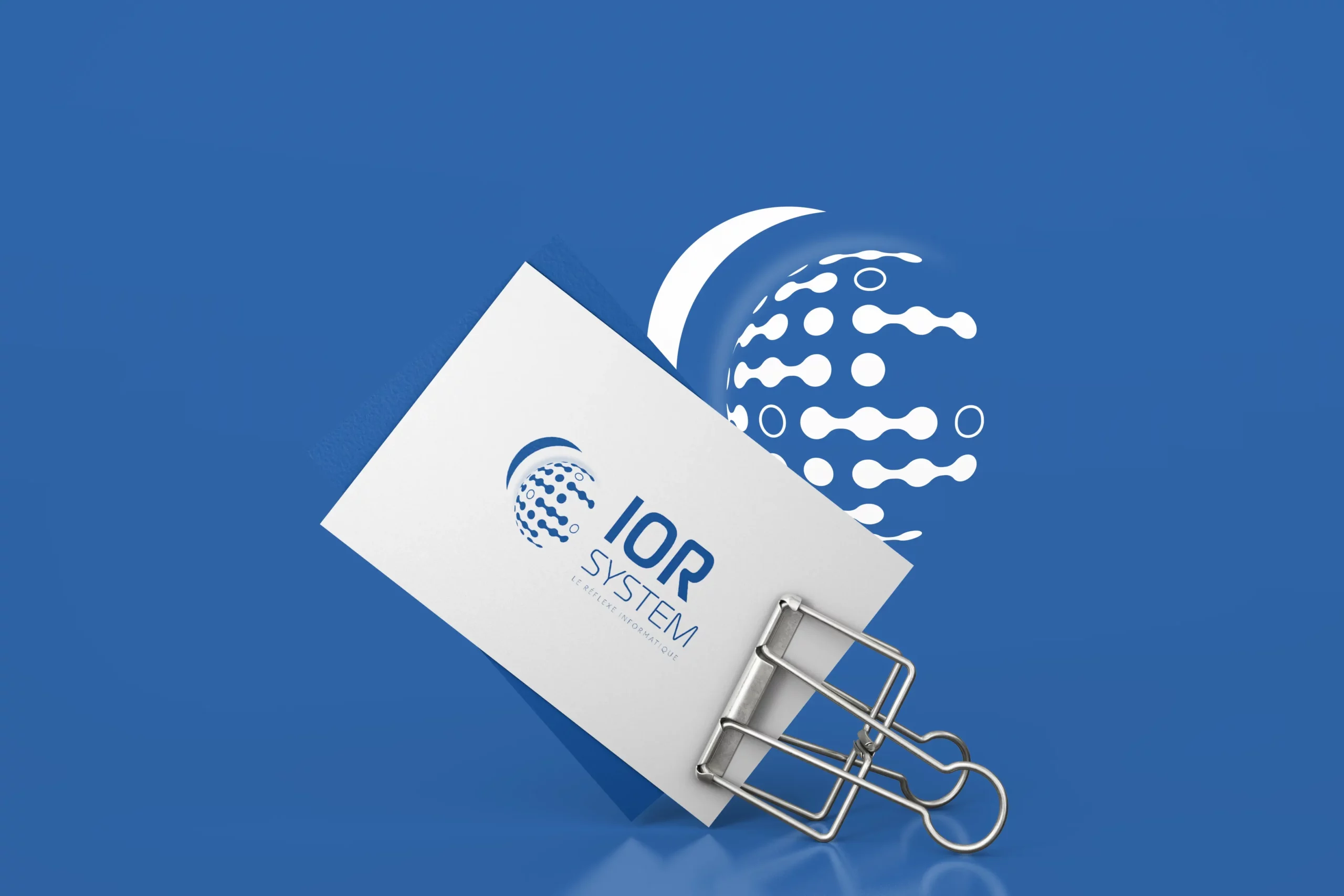
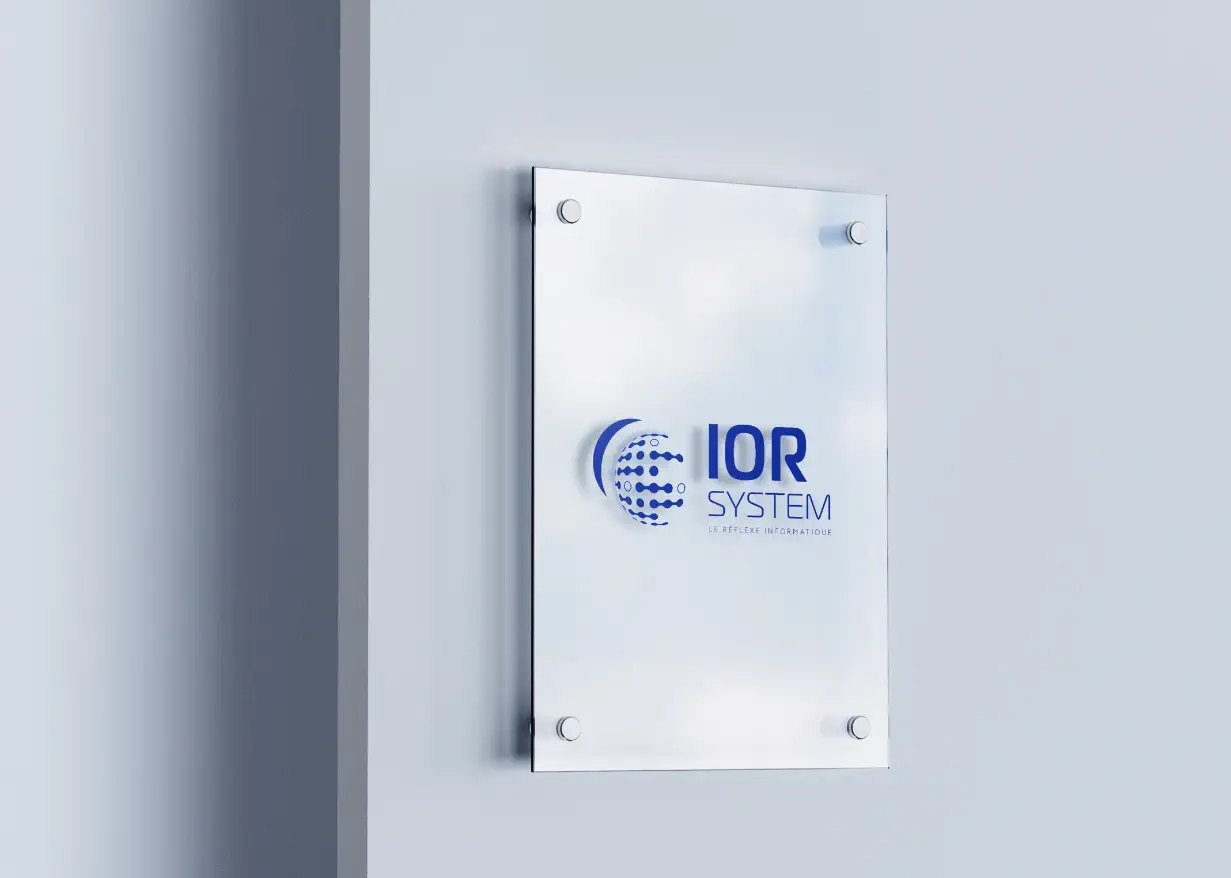
With the slogan “LE REFLEXE INFORMATIQUE”, we have positioned IOR System not just as a service provider, but as an essential partner for companies seeking to digitize and secure their operations. The new communications strategy aims to reinforce this image by highlighting the customized solutions and added value that IOR System brings to every customer.
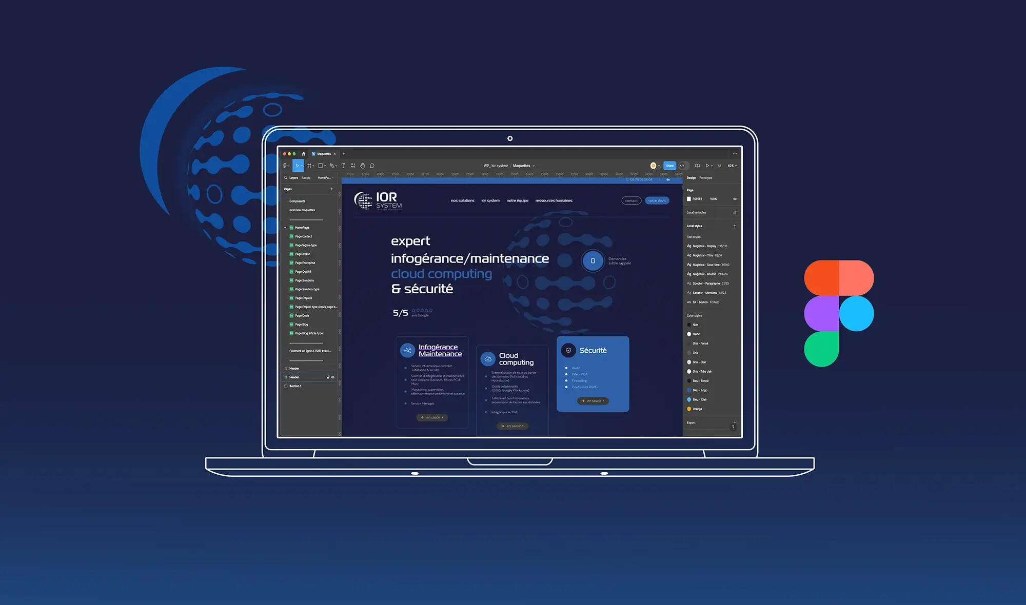
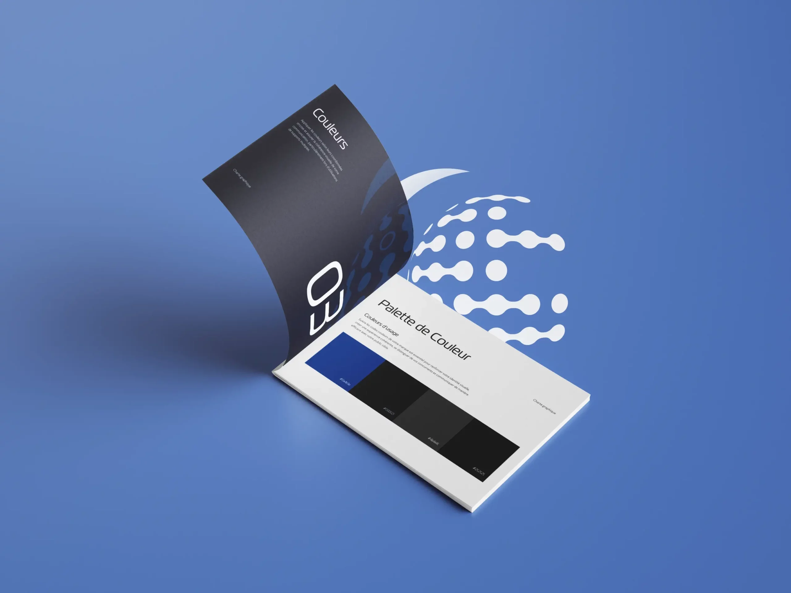
I chose a cameo of blue for the new corporate color palette, symbolizing the confidence, security and peace of mind that IOR’s services bring to their customers. The rebranding was accompanied by the development of the user experience (UX) and user interface (UI) for their new website, accessible at www.ior-system.com, which offers intuitive navigation and a clear presentation of the services on offer.
The result is a revitalized brand that speaks directly to modern businesses, emphasizing the importance of reliable IT management and a secure infrastructure. This positions IOR System as an innovative leader, ready to meet current and future technological challenges.
