Scope
Sculpting a Brand for an Active Lifestyle
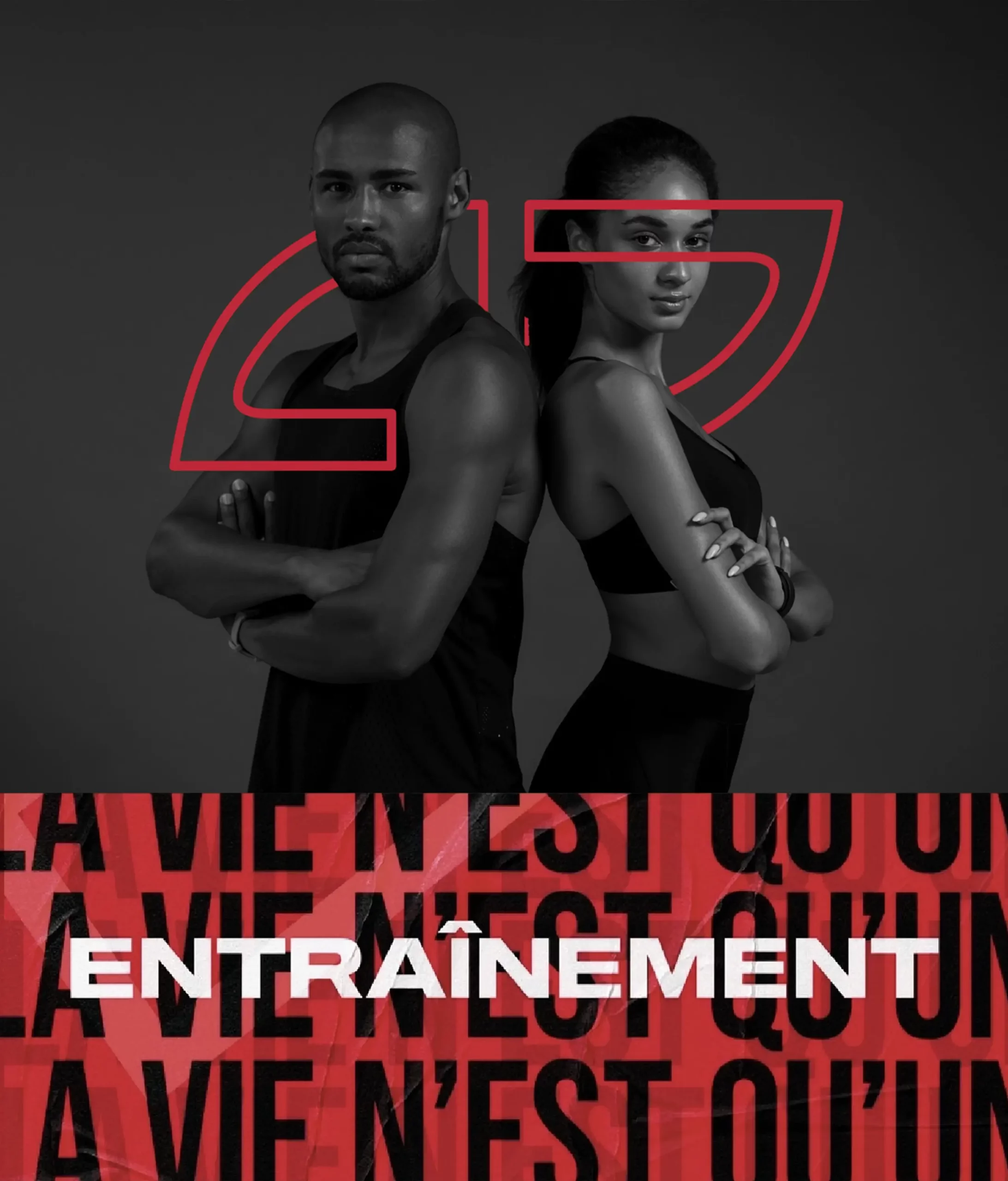
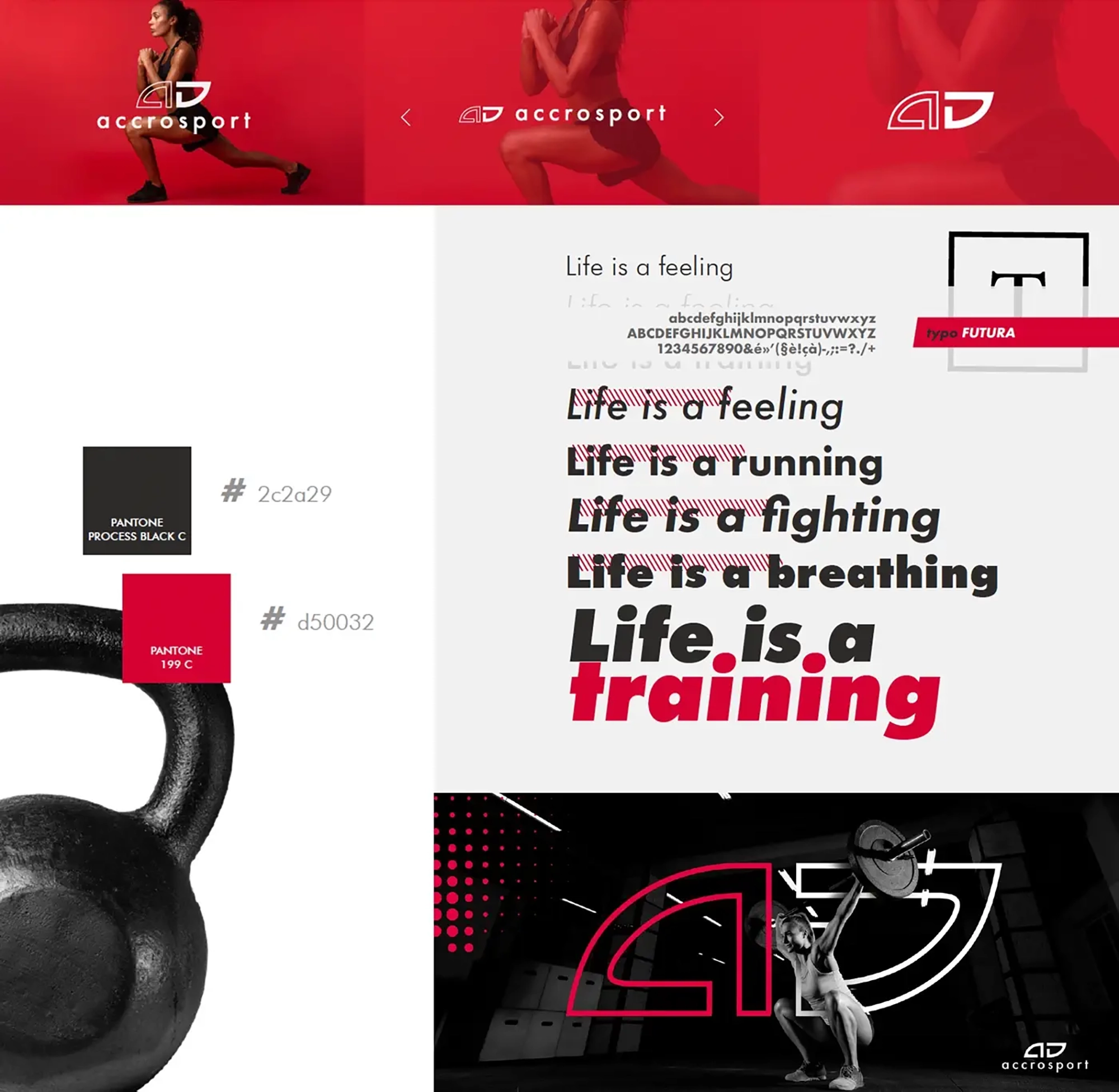
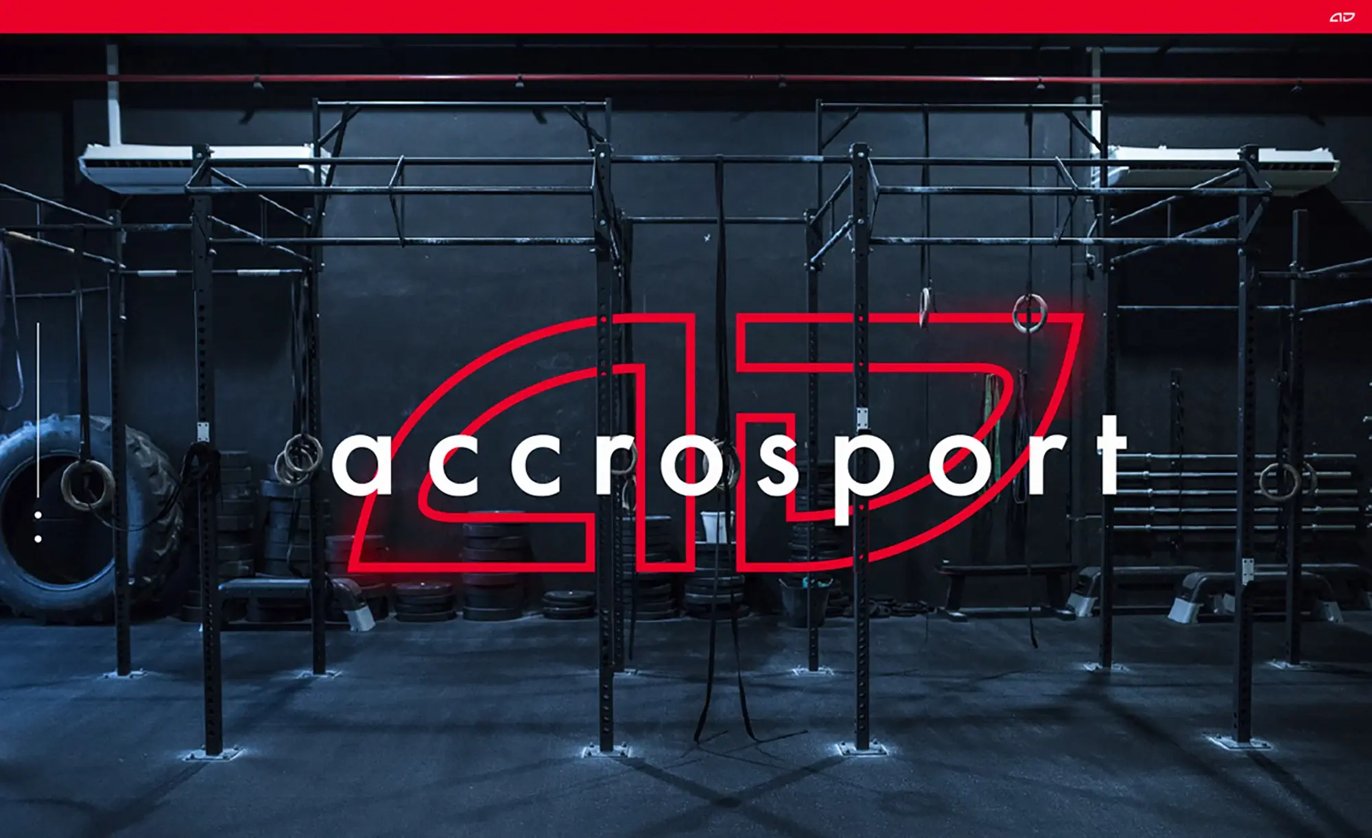
At the heart of this transformation, initiated by the D-impulse agency, was the revisiting of the Accrosport logo. Originally solid, the logo was lightened by the introduction of contours in part of the pictogram, offering a new visual dynamic. This simplification has created a new visual identifier, the “Accrosport check”, symbolizing approval and success in achieving personal fitness goals.
Brand development
Activate your full potential
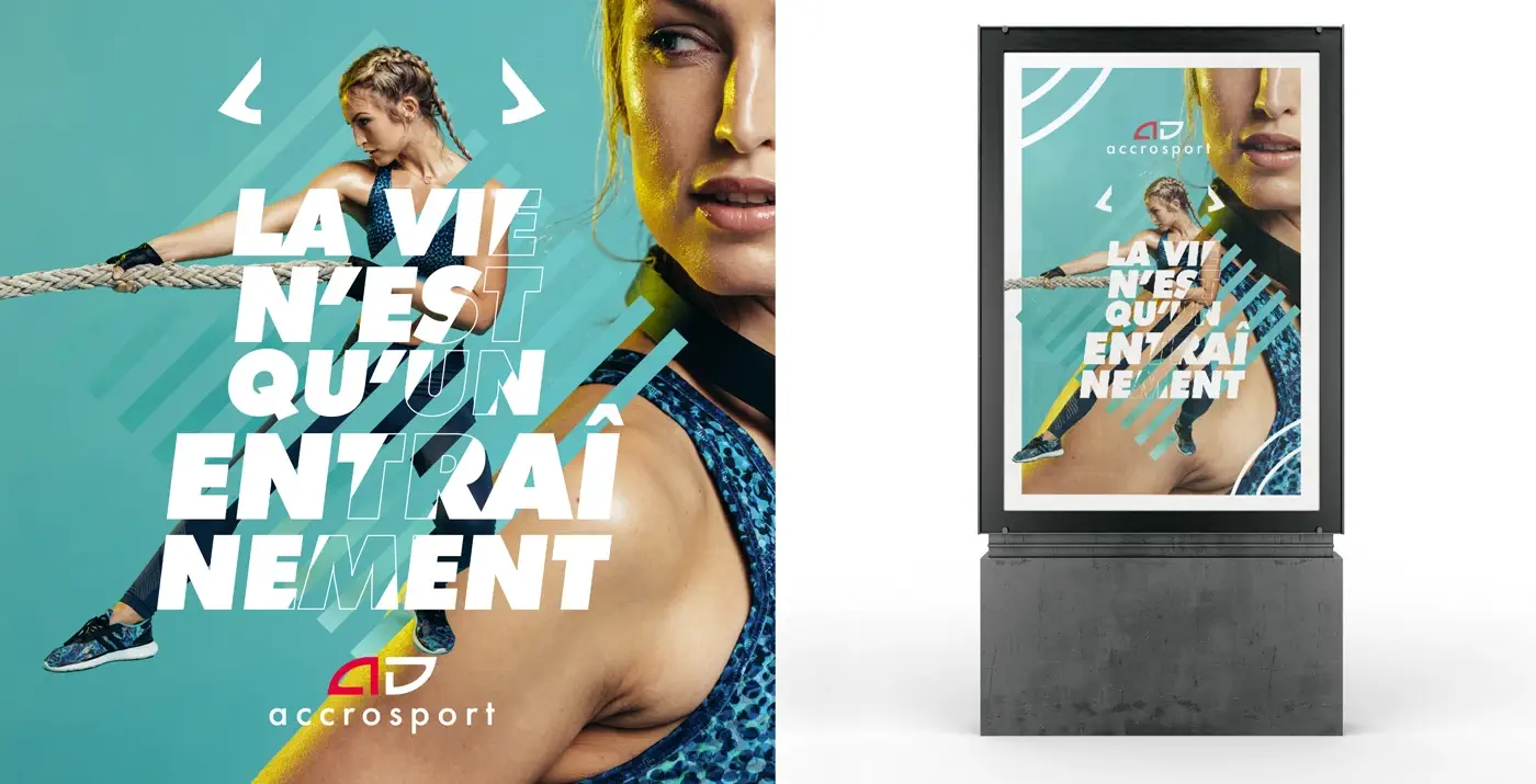
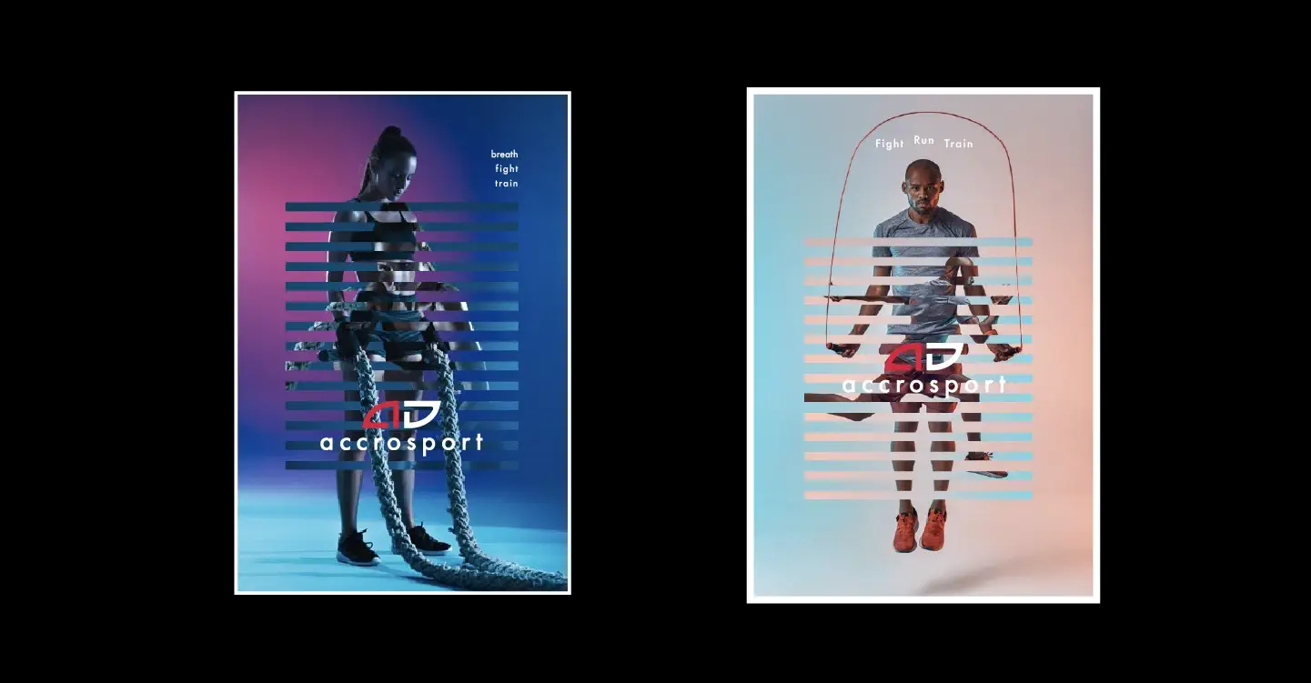
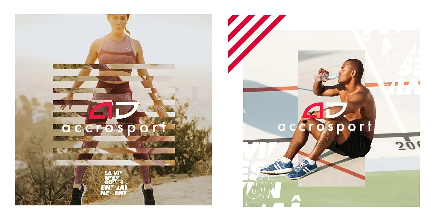
The adoption of the slogan “Life is a training” marked a turning point, repositioning fitness as an ongoing life journey rather than just a gym routine. This philosophy was at the heart of viral campaigns on social networks and bold outdoor advertising, notably to promote the ST45 campaign, which captivated the targeted audience.
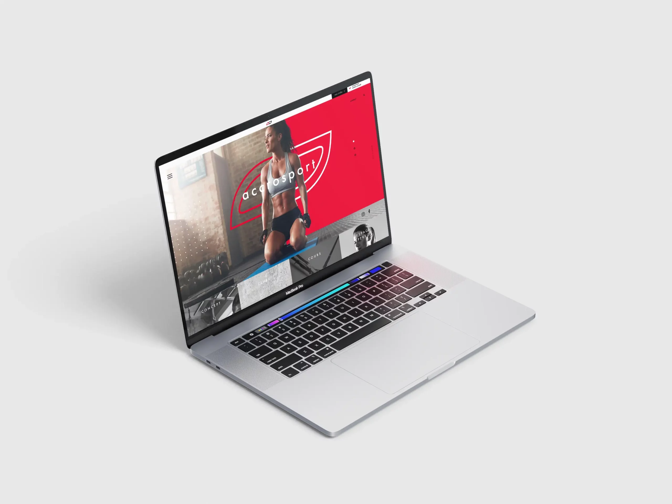
The visual impact and renewed message were integrated into every aspect of brand communication, from the user journey on the new website to the design of the mock-ups developed by our team. This global rebranding not only strengthened Accrosport’s position in a saturated market, but also redefined the way the brand dialogues with its followers, encouraging them to see fitness as an essential and enriching part of their daily lives.
Today, Accrosport is more than just a place to work out; it’s a constant companion in the quest for an active, fulfilled lifestyle.
