Brief
Defining the aqua x crossfit “strategy”
Objective
Design a visual identity for AquaCrossFit that combines dynamism, innovation and accessibility, primarily targeting a young, sporty audience.
Target
Young athletes, amateurs or experts, aged 18 to 55, looking for new sporting experiences.
Visual style
Motivating, inclusive, modern and energetic, with a palette combining freshness and energy (blues, greens, oranges, reds).
Key elements
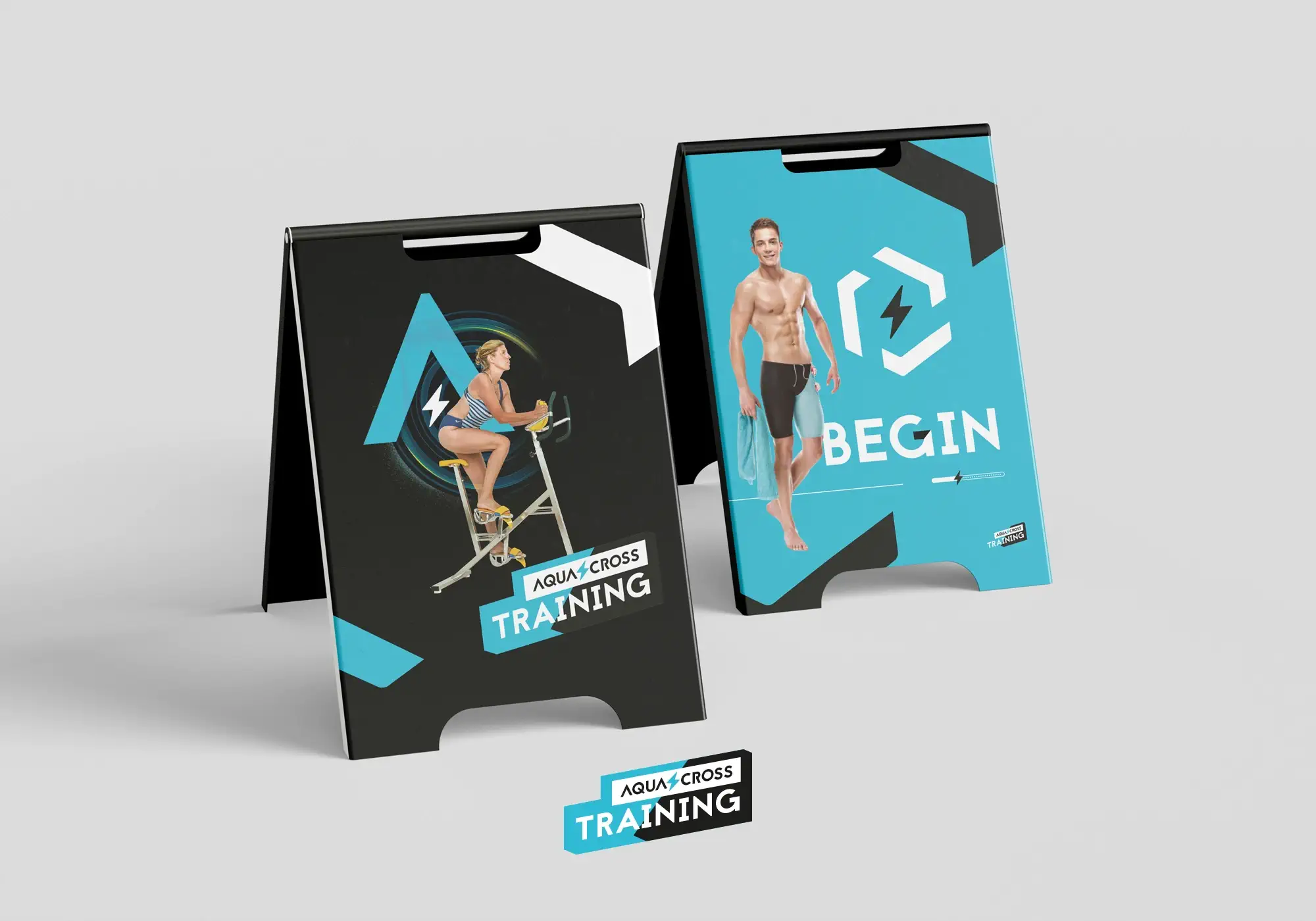
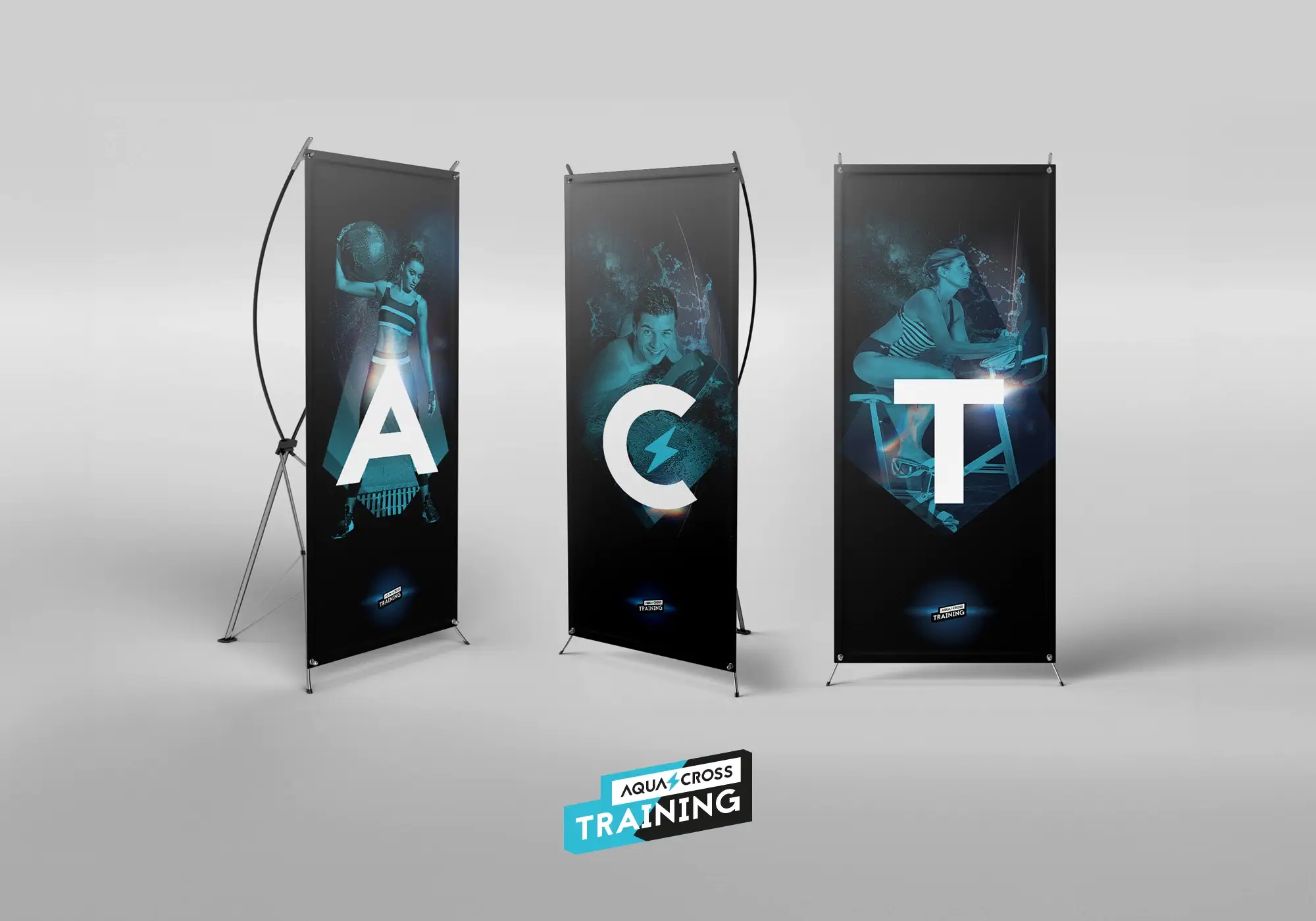
Logo and variations adapted to digital and physical media.
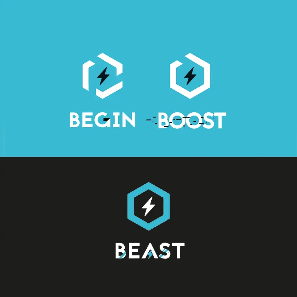
Distinctive icons for different workshop levels (Begin, Boost, Beast).
Complete style guide, including typography, colors and use of images.
Brand objectives
Attract a younger audience with a renewed proposition and establish AquaCrossFit as a signature product of Vert Marine.

Logotype
Sport, energy
and excellence for all
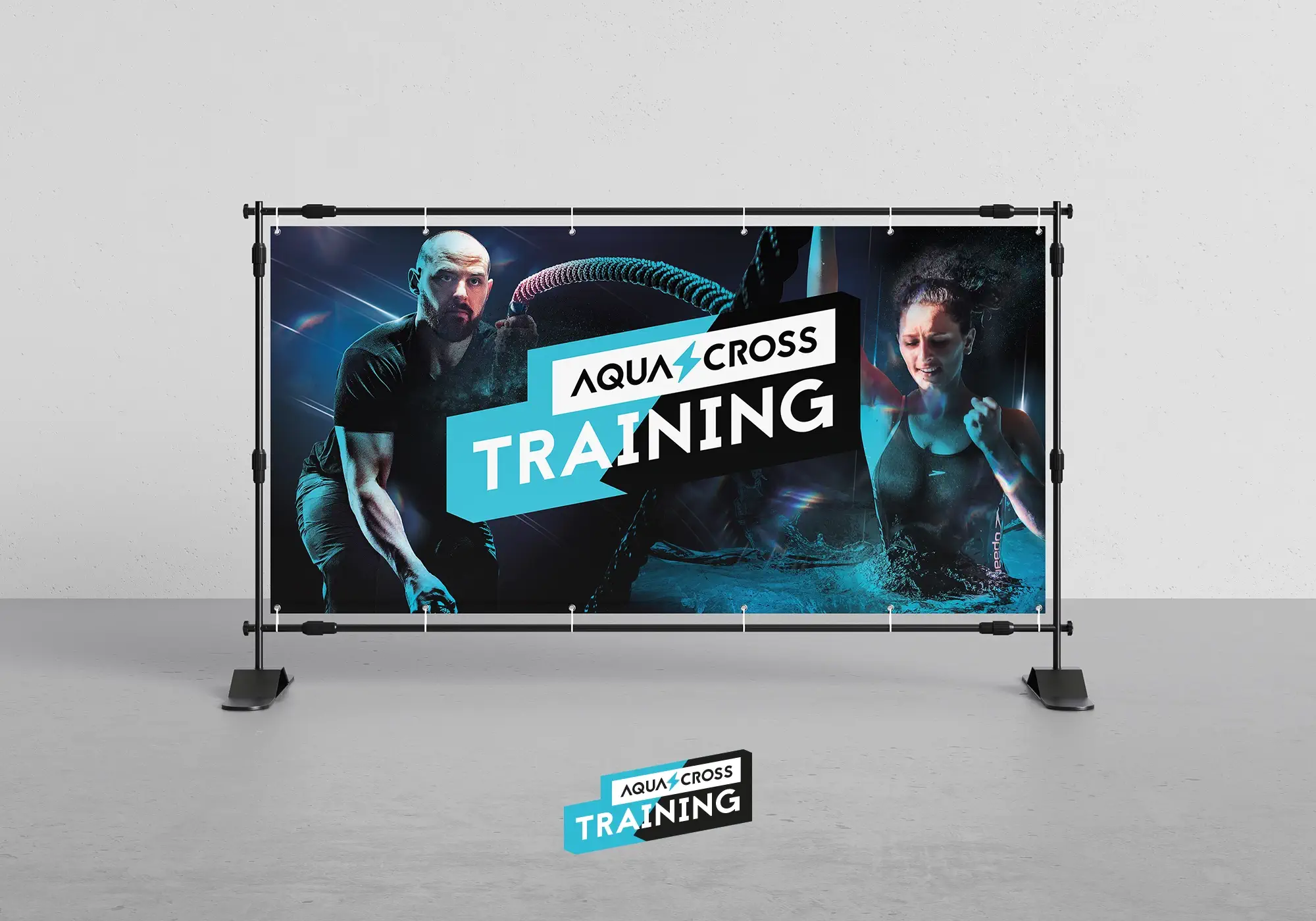
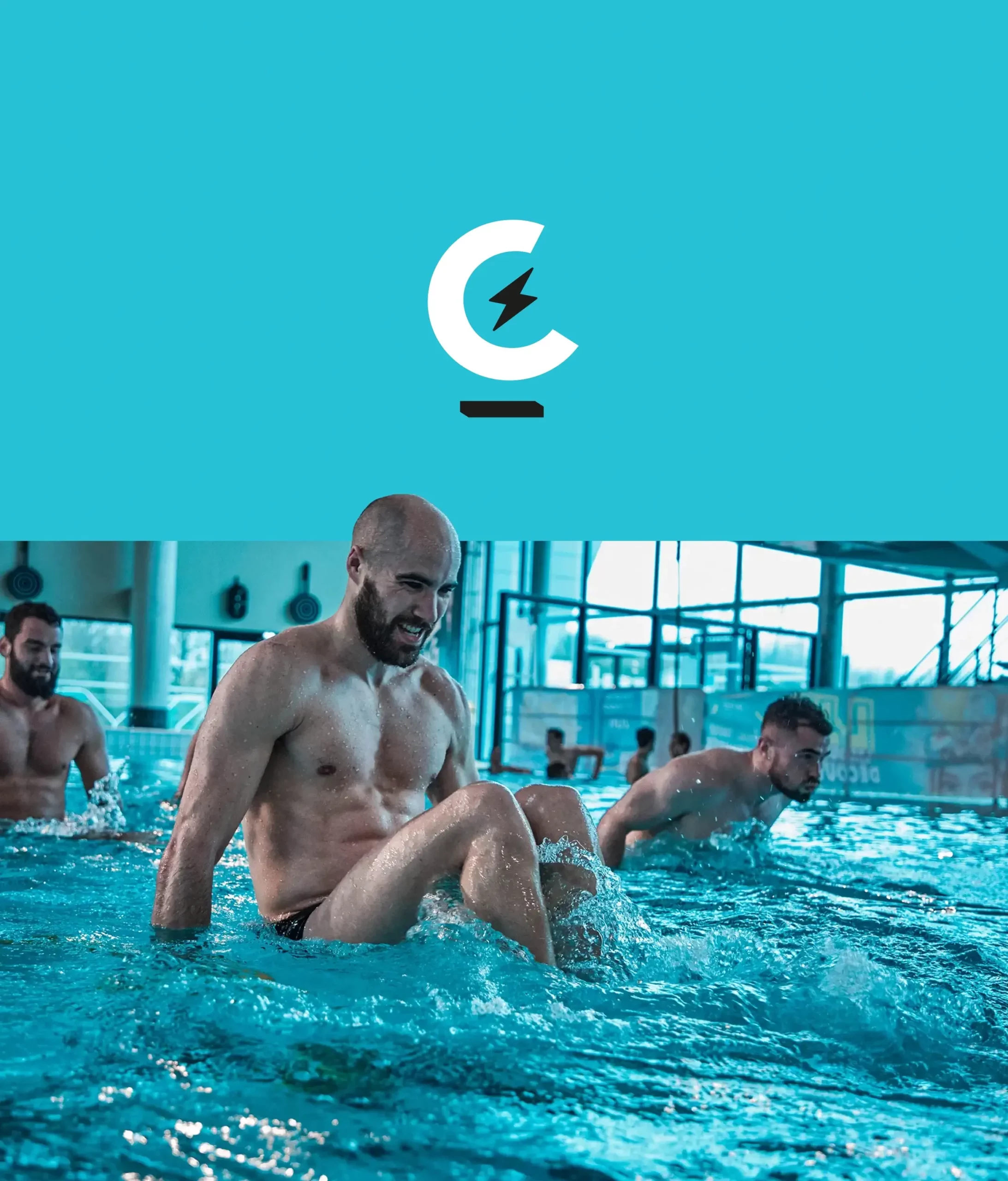
Following the customer’s request, I began the process of creating the logo, respecting the visual identity of the range. I then developed the orientations and favicon using colors such as electric cyan and grayish black to evoke the aquatic and crossfit universe. The lightning bolt symbolizes the energy needed to meet the challenges proposed, while the choice of the C for the favicon refers to the circularity of the workshops.
Once the logo had been validated, we worked together on the design of the different workshop levels, their conditions and their names:
- Beginner workshop : ACT Begin
A 45-minute session in which teams have to complete a predefined course as quickly as possible. - Intermediate workshop: ACT Boost
A 45-minute session during which teams must complete a circuit as many times as possible within the allotted time. - Expert workshop: ACT Beast
A course that evolves with each lap, to push your limits in 45 minutes.
